 The modernist movement of the beginning of the 20th century is the usual subject of my blog entries and, to be honest, the subject that I am attracted to the most. However, my recent discovery of D.A. Rovinskii’s seminal work on the Russian lubok drew my attention to some of the themes and colors from the 17th century that were later borrowed by modernists hundreds of years later.
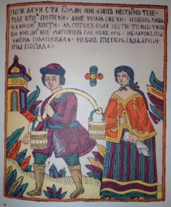
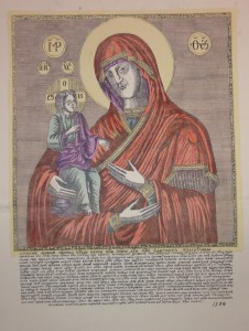
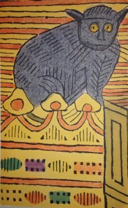
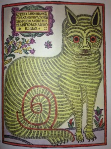
Lubok (plural Lubki) is a kind of Russian folk print that first appeared in the 1600s as an affordable replacement for an icon or a religious text. Similar in look and intention to the modern comic strip, it is characterized by a large, brightly colored picture with a short caption or story on top or the bottom of the page. The subject matter for approximately the first hundred years was exclusively religious, after which it became a convenient and cheap way to distribute information, stories with morals, and propaganda by the 18th century. The simplicity of the primitive wood print style and the limited number of colors (only red, green, purple, and yellow were used) allowed a wide and affordable distribution of satire and propaganda. The style afforded the artists to relate the message with extremely bright colors and skewed perspective (often more important figures are disproportionately larger than others). The style also made it easier to depict several time periods in the same print, picturing the hero doing several different things at once, or in the case of the icon prints of Virgin Mary, many similar images on the same page with different captions. In many cases, the composition and the simplicity of the drawing was dictated by the technique of woodblock, forcing the images to be more clear and expressive. The later lubok artists implemented the use of copper plates, allowing more detail and more text. However, some lubok experts don’t regard these as true to the style and lacking in expression and compositional clarity. Also, when these more elaborate prints were colored by the same peasants as the simpler woodblocks, the coloring quality decreased and often large areas were painted without regard to lines or designs of the print.
Although lubok as a method of distributing information or icons lost its popularity in the 19th century with the advancement of lithography, lubok as an art style still survives. Many aspects of the primitive folk style were incorporated by the 20th century modernists into their own illustration and stage design work. Natalia Goncharova, one of the most important artists in the modernist movement, was an active proponent of getting back to the roots of Russian art – icon painting and lubok. It is also often used in contemporary illustrations of children’s books as the representative primitive folk style of illustration. The importance of lubok in Russian culture and art cannot be overlooked. My recent discovery is a testament to this importance.
Rovinskii’s Russkiia Narodnyia Kartinki (Russian Folk Pictures) from 1881 remains one of the seminal works on Lubok, a phenomenon about which relatively little has been published. It consists of five volumes of text and an oversized folio “atlas” of stunning prints, some of which are so large, they are folded several times in order to fit into the folio. I have consulted the text in the past, without realizing what a treasure its supplement represents. It contains only the earlier religious prints, but one can trace the changes between the woodblock and copper plate techniques, as well as the amazing consistency of color. The most surprising thing about this folio though for me was the brilliance of color. Because it is one of the defining characteristics of lubok, I expected bright colors, but not this extent of their saturation and brilliance. If you, too, are interested in lubok, you can view both, the 5 volume set by Rovinskii and the supplement folio of prints in the reading room of Special Collections.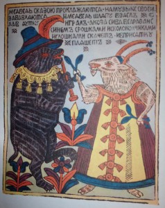
Masha Stepanova
Slavic Librarian