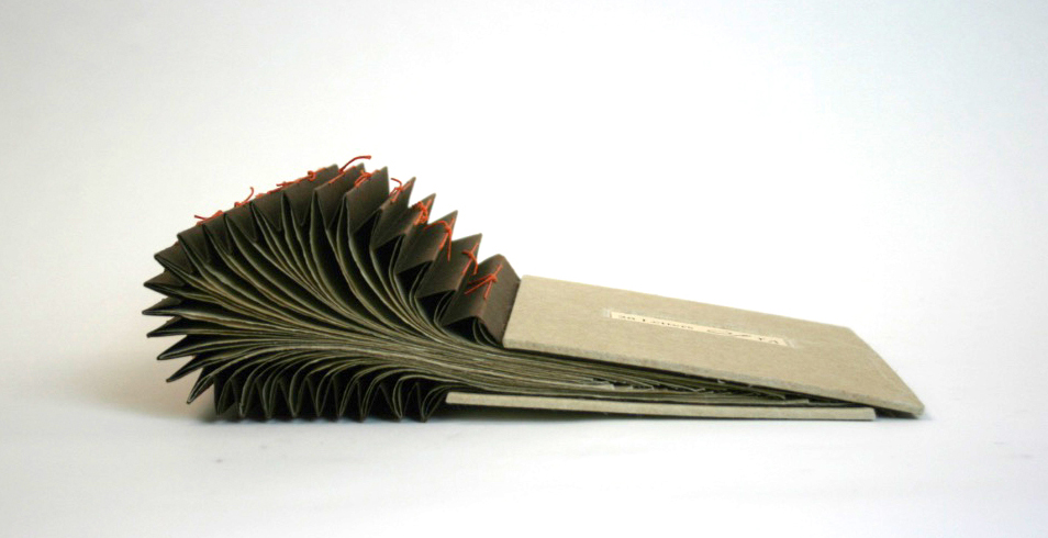
28 Letters by Islam Aly
The fall exhibit in Special Collections, Creative Codex: Books as Art in the Walter Havighurst Special Collections, was created to harmonize with Miami University’s year of Creativity and Innovation. As the Preservation Librarian, I have spent countless hours assisting the curators of Special Collections with preparations for their exhibits. When the year of Creativity and Innovation was announced, I jumped at the chance to not only curate my very first exhibit, but to curate an exhibit on one of my favorite holdings in Special Collections – Artists’ books.
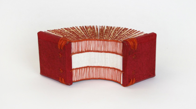
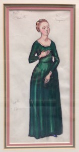
Crucial Perimeter 1, by Islam Aly
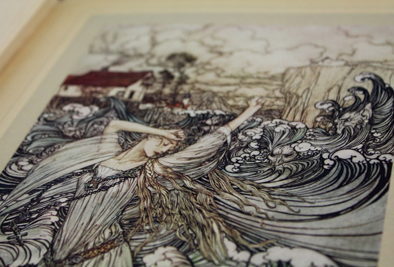
So what, exactly, is an artist’s book? The definition itself is usually up for some debate. I’ve seen artist’s book defined as “a work of art that utilizes the form of a book,” however there are plenty of examples in the exhibit that seem to contradict this definition such as Lee Krist’s How to Transition on Sixty-Three Cents a Day, or Family Tree by Julie Chen. The Smithsonian Library defines an artist’s book as “a medium of artistic expression that uses the form or function of “book” as inspiration,” and further claims it is the artist’s intent that truly defines an artist’s book. Regardless of a concrete definition, most artist’s books are created to make art that is interactive, portable, and easily shared.

Family Tree by Julie Chen
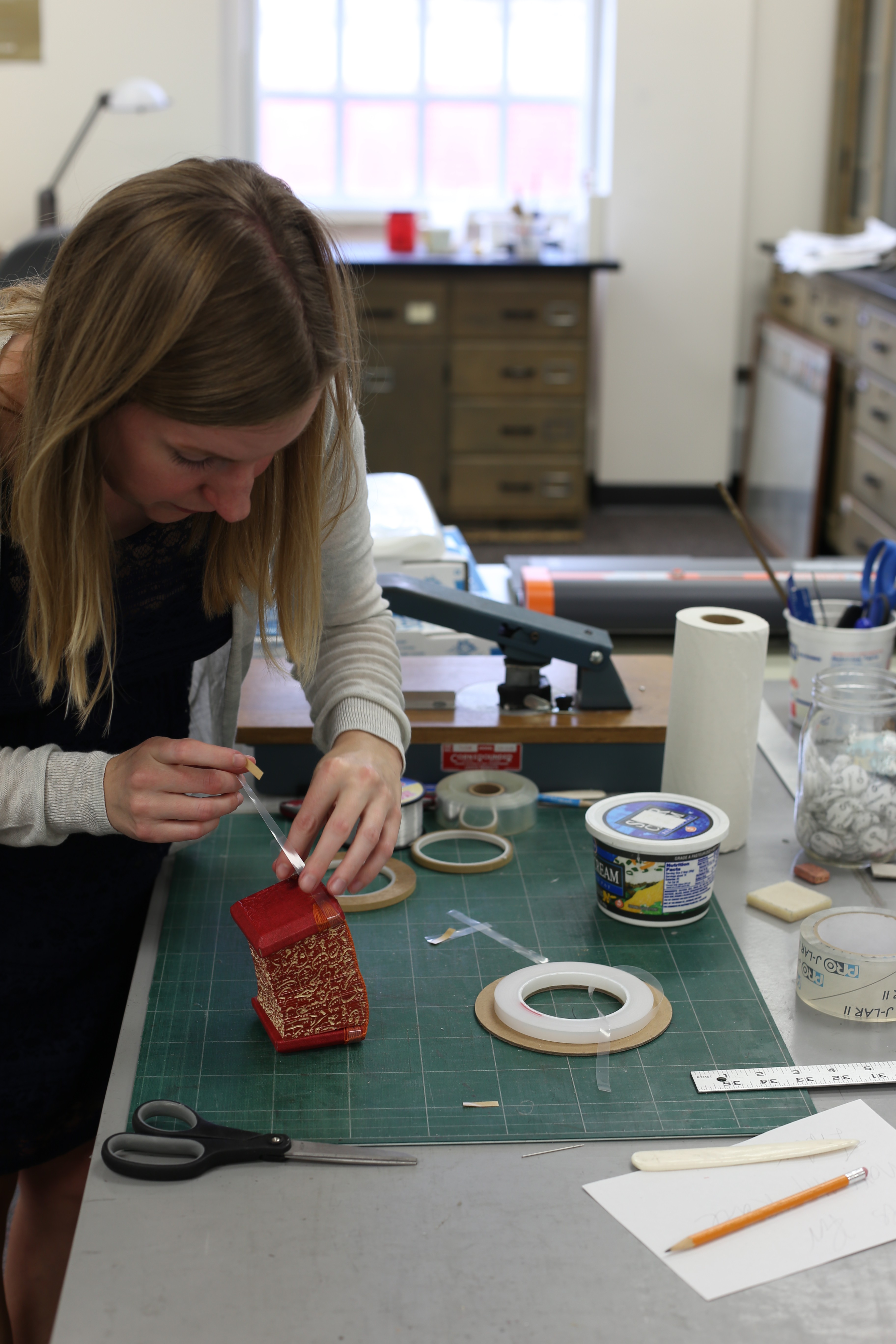
One of the unique challenges of this exhibit was in figuring out how to display these works of art. Even traditional books can be difficult to display, as they are meant to be read, and the pages turned. Artists’ books took this challenge to a whole new level. Unlike traditional works of art, such as paintings, drawings, and even statues, artists’ books are truly made to be handled by the viewer. In fact, many of the books rely on the viewer’s interaction in order to meet their full potential. Artists’ books are certainly not made to be locked up behind glass and viewed statically from the other side. In order to reconcile the interactive nature of artists’ books with the static nature of exhibits, I examined each book for the most dynamic position for viewing. In the majority of cases, that meant the book was to be fully opened and extended, with as much of the structure and content visible as possible.

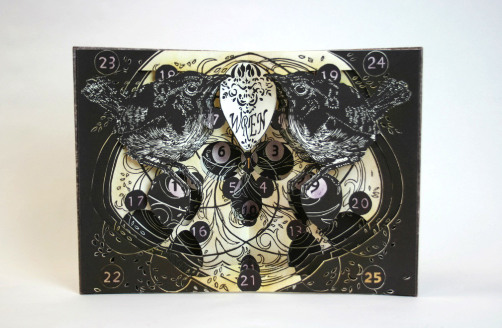
An Exquisite Future by Corcoran School of the Arts & Design
Once I had all the books chosen our Curator of Special Collections, Carly Sentieri, assisted me with the basic layout of the exhibit cases. The next step was to create custom cradles and supports. Creating the cradles for artists’ books was a little different than I was used to. Hardly any of the books in the exhibit open in the traditional fashion of a codex. Coupled with my determination to display the books as dynamically as possible, my challenge was to create supports that would allow for the visual I wanted, but with the support that was needed. Many of these books are unique or very limited run, handmade items. The last thing I wanted to do was irreparably damage these beautiful objects in the pursuit of showing them off.
XX by Carrie Ann Plank
For the majority of the book supports I used sheets of PETG, a transparent, thermoplastic material that can be bent and formed by hand. The PETG sheets created a rigid structure that the book could be strapped to, creating a support that both cradled the book and held it in place.
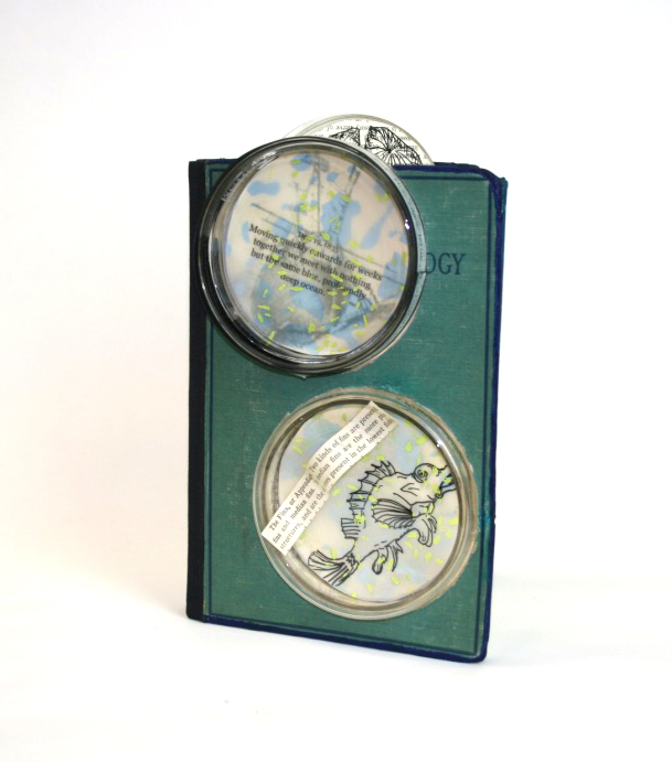
Darwin at Sea by Diane Stemper
Creative Codex: Books as Art in the Walter Havighurst Special Collections is currently exhibited in the Walter Havighurst Special Collections (King Library, room 321), and will remain on display until the beginning of December. An opening reception for the exhibit, featuring guest speaker and local book artist Diane Stemper, will take place on Thursday October 22, from 4-6pm in King Library room 320.
Ashley Jones
Preservation Librarian


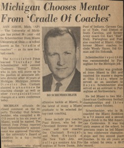
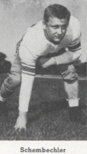 Schembechler is most known for being a College Football Hall of Fame coach at the University of Michigan, and the Ten-Years War with rival/mentor Woody Hayes at Ohio State University. However, before his coaching success he was a student-athlete at Miami University.
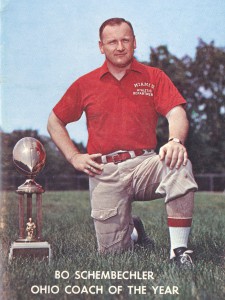
 Miami University and Cradle of Coaches Hall of Fames.
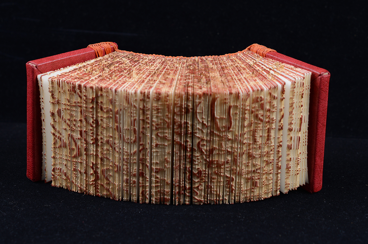


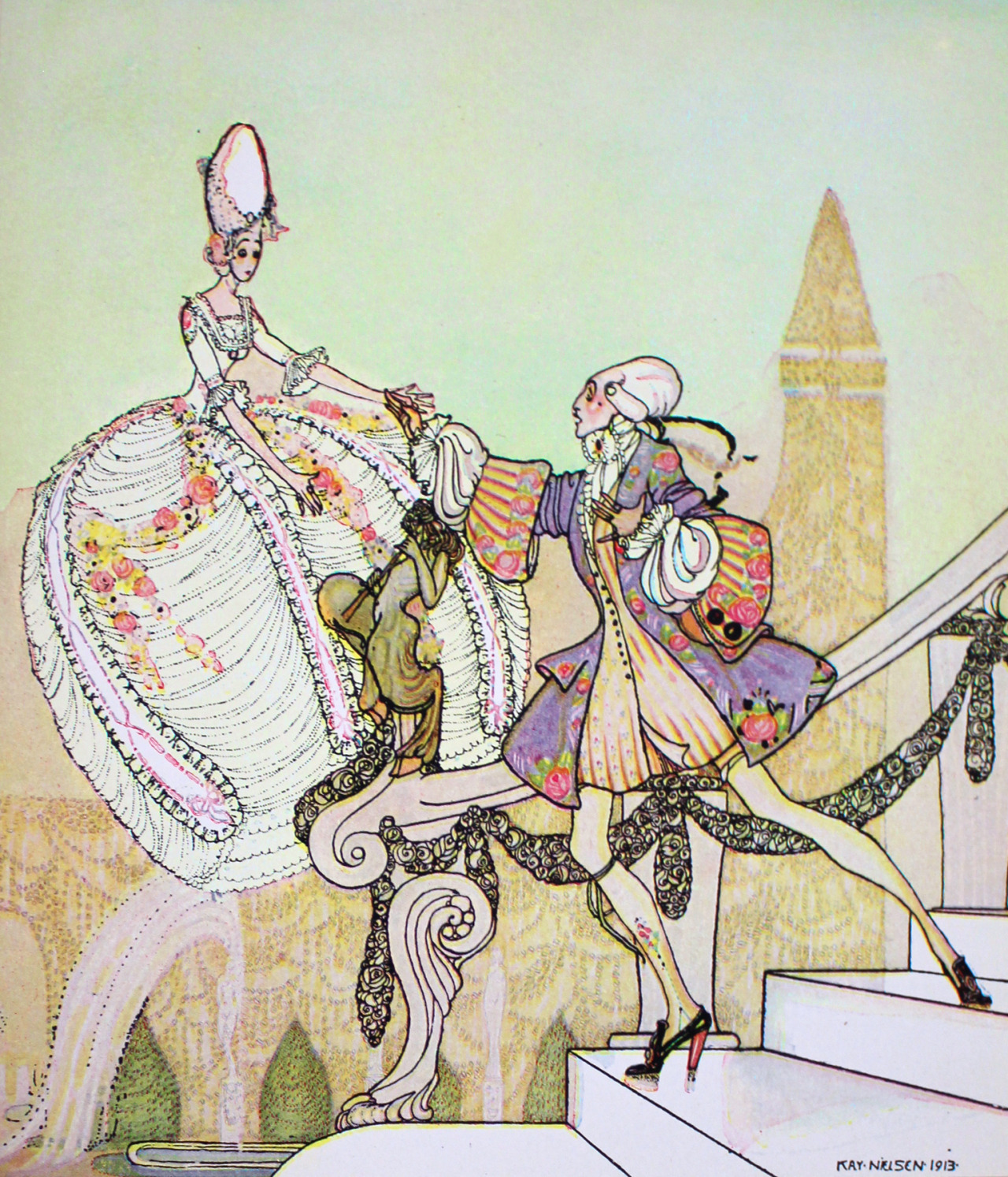
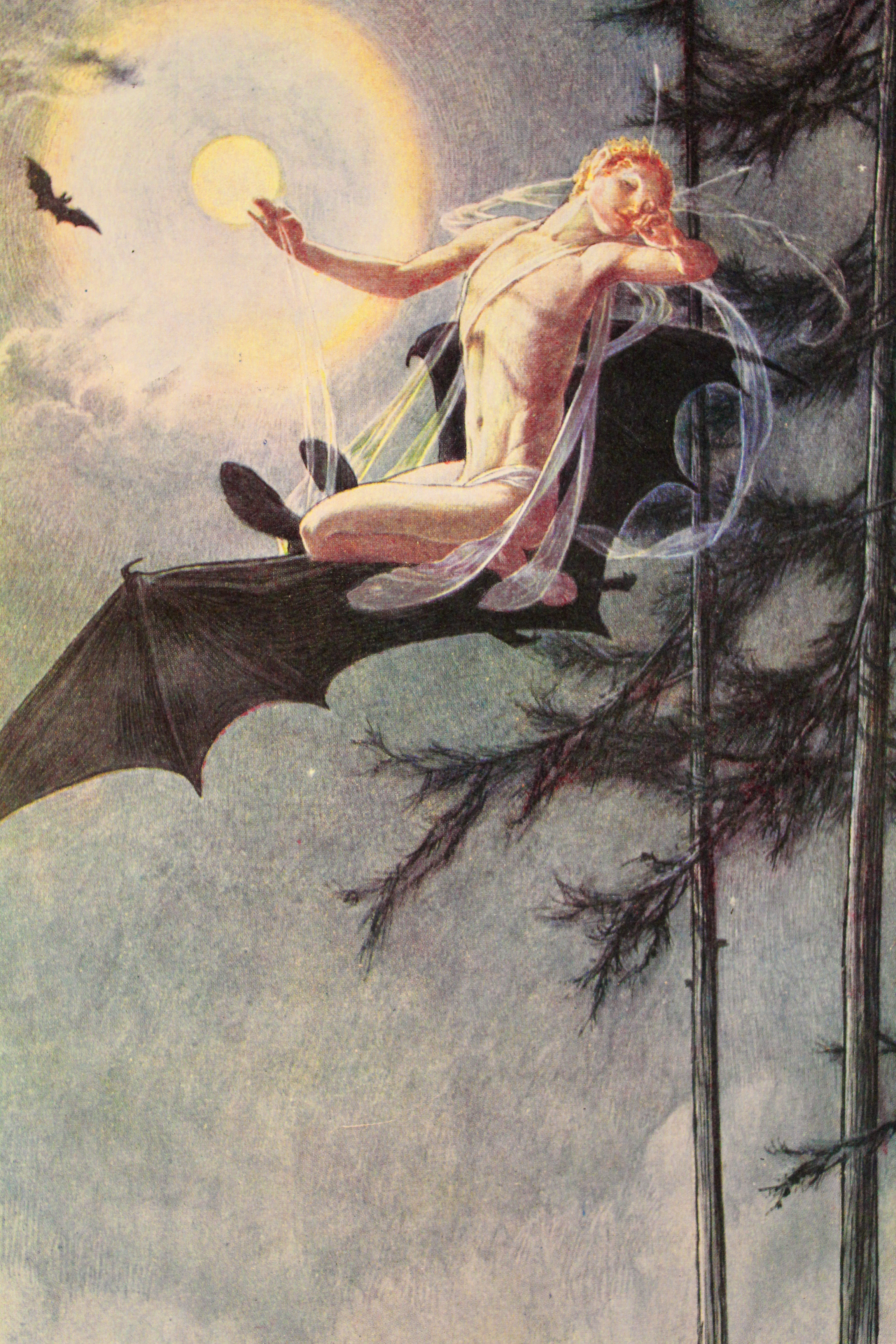
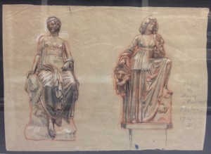
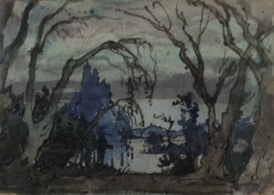 Recently I shifted the framed art in the André and Catherine de Saint-Rat collection, which drew my attention to how little this collection is known and used. In class presentations and private viewings I most often pull books and portfolios, rarely adding one or two framed pieces. It’s easier to pull books or even posters than larger paintings and the requests I usually get are almost always for books. However, the fine art pieces are very impressive and possibly the most valuable part of the larger de Saint-Rat collection. Among couple dozen framed paintings and lithographs by various artists from different time periods, several are by Alexandre Benois, who was an extremely important 20th century figure, especially in the context of the de Saint-Rat collection. He was possibly the most influential artist, art critic, theater designer, and author of the Silver Age. He was responsible for the creation of the group Mir Iskusstva (World of Art), establishing the aesthetic for stage design through his work with Diaghilev for the Ballets Russes, as well as for the recognition of many artists, whose careers may not have happened without his involvement.
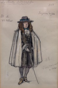
 Alexandre Benois (1870-1960) came from a famous family of artists and architects in Russia, which continued the tradition for several generations. He attended the Academy of Arts in Saint-Petersburg, but did most of his training with his older brother and on his own. IUrii Annenkov, also well represented in the de Saint-Rat collection, remembered Benois as an autodidact, whose passion for art extended to all time periods, all nations, and all forms. Benois authored several multi-volume works on art history, painting history, and Russian art. Annenkov also credits Benois with being the father of Russian graphic arts. Before the beginning of the 20th century in Russia there were master draftsmen, but with the influence of Benois there emerged such graphic artists as Konstantin Somov, Eugene Lancer, Leon Bakst. His support extended to young artists working in other forms, as well. Marc Chagall was one of Benois’ protégés. The creation of the World of Art group by Benois and Diaghilev helped Russian art expand its range and focus. With the financial help of Princess Maria Tenisheva and Savva Mamontov, who were passionate supporters of artist colonies in the 19th and 20th century, Benois and Diaghilev were able to publish the art magazine “World of Art,” spreading their influence farther. The very first issue of the magazine in 1898 challenged the prevalent ideology of realism. Annenkov insists that this influence and the influence of Benois’ linear, clear, and very architectural work was ideological rather than stylistic. His unmistakable compositional elements, extreme expressiveness and elegant brushstrokes are very recognizable and, while still representational, go beyond realism in their transparency and weightlessness.
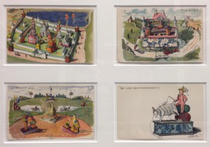
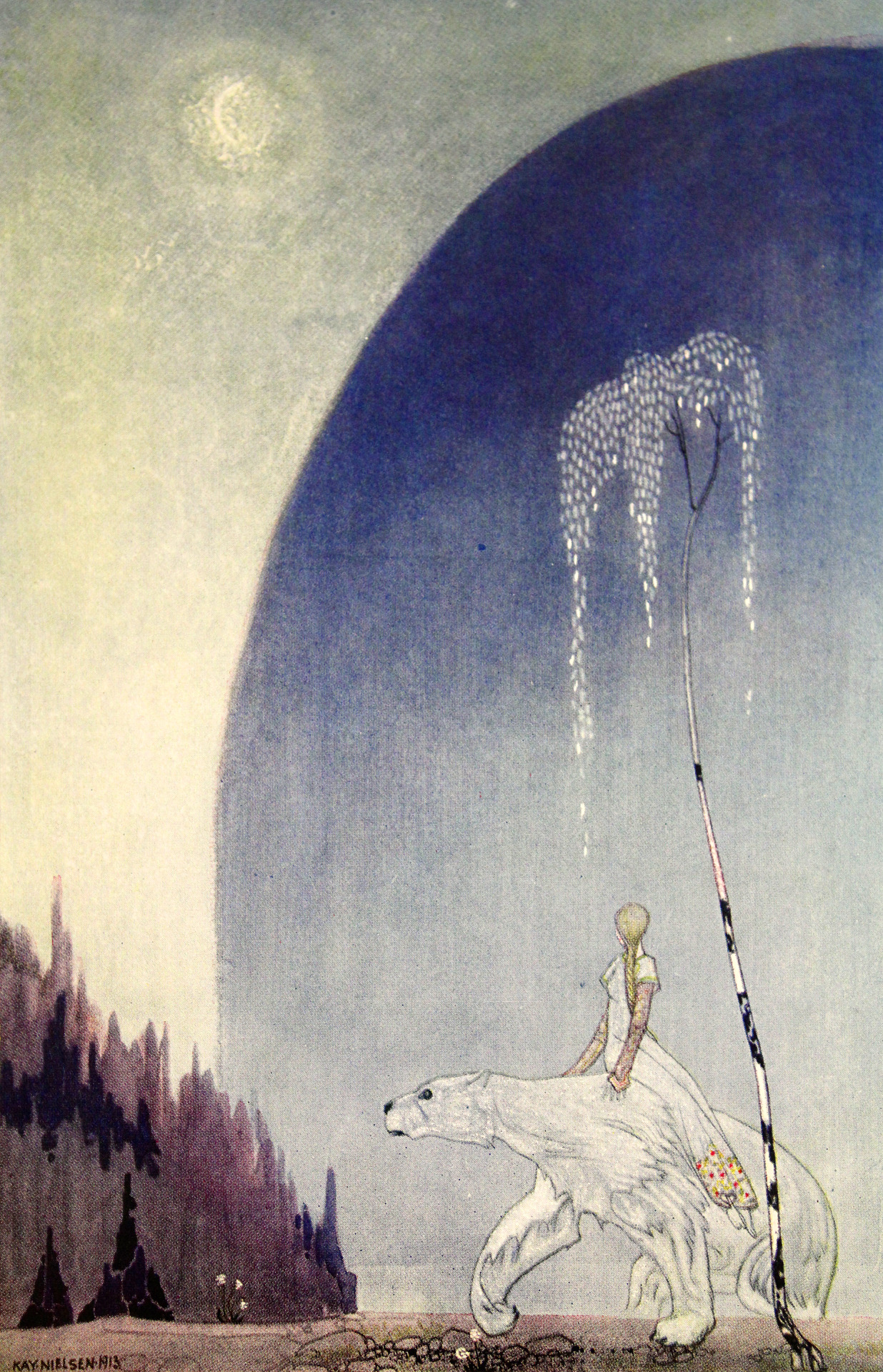
 The originals of Benois’ drawings and watercolors are not the only examples of his remarkable work. He illustrated many books, which are also a part of the de Saint-Rat collection. The Bronze Horseman is probably his best-known illustrative work. There are several editions of it illustrated by Benois and other artists in Special Collections. There is also a lot more to Alexadre Benois than can be addressed in a blog entry. Stop by Special Collections to discover more about this remarkable figure and to see the pieces in person.